Shape Bit: A Display Font That Demands Attention—Wisely
First Glance: Sharp, Structured, Slightly Playful
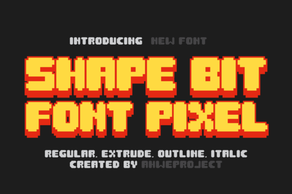
Opening Shape Bit feels like stepping into a well-lit studio where geometry and intention collide. It’s not loud—but it’s unmistakable. The letterforms are built on clean angles and subtle asymmetries: a tilted ‘A’, a stepped ‘R’, a softened corner on the ‘G’. There’s no forced whimsy, no over-engineered quirk. Instead, Shape Bit carries a quiet confidence—modern typography with tactile presence. It reads as both precise and human-made, like a hand-drawn sketch refined into something repeatable, scalable, and intentional. This isn’t a font for background noise. It’s for moments you want to anchor, emphasize, or elevate.
Where It Lives—and Thrives—in Real Projects
Shape Bit excels where clarity meets character: logo design for boutique studios, artisanal food brands, indie publishers, and creative digital sellers. I’ve used it in brand identity systems where clients needed a distinctive yet professional mark—not too cold (like many geometric sans serifs), not too soft (like most script fonts). On packaging design, it holds up beautifully on matte-finish labels and kraft boxes; its structure gives weight without heaviness. For product labels—especially for candles, ceramics, or small-batch skincare—it adds premium perception without shouting “luxury.”
In editorial design, Shape Bit works best as a title font: magazine covers, chapter headers, blog graphics. It pairs cleanly with a warm serif font for body text—think Garamond or Lora—creating rhythm without competition. In web design, it shines in hero sections and CTA buttons, but only at sizes 32px and up. Smaller? It loses its nuance. As a display font, it’s not meant for paragraphs—or even subheads. Respect its role.
Social media graphics benefit from Shape Bit’s strong silhouette: Instagram quote cards, Pinterest pins, and LinkedIn banners gain instant visual cohesion. For digital ads, it cuts through clutter when used sparingly—say, one bold word in a headline (“Made”, “True”, “Now”). In printable design—invitations, event posters, craft fair signage—it translates crisply to both laser and inkjet output. And yes, it works in Canva templates and Cricut projects, though always test cut files at actual scale: those tight corners need clean vector paths.
Where to Pause—And Why
Shape Bit is not your workhorse. Don’t reach for it in long-form UI, navigation menus, or email body copy. Its personality is too strong for supporting text. Avoid lowercase-heavy settings unless you’re deliberately leaning into contrast—its uppercase forms are bolder, more resolved. And while it’s highly legible at 48px+, don’t test it at 14px on a mobile screen and call it “versatile.” It’s not. It’s selective.
Use it for short phrases, not sentences. For brand marks, not taglines longer than three words. For decorative accents—like a single word embossed on a notebook cover—not full product descriptions. When used on premium packaging, it communicates care and craftsmanship—but only if the rest of the design supports that tone. Pair it poorly (say, with a busy handwritten font or an overly ornate serif), and Shape Bit can feel isolated, even awkward.
How It Shapes Perception
Shape Bit influences audience trust indirectly: its consistency and structural integrity suggest intentionality. That matters. A small business owner using it on their website header signals they understand visual hierarchy—and by extension, user experience. In social media graphics, it boosts recognition across platforms because its shape is distinct enough to become a subtle visual signature over time. But it doesn’t shortcut professionalism—it amplifies it, *if* applied with discipline.
Readability isn’t about speed here—it’s about impact. You don’t skim Shape Bit; you register it. That makes it powerful for engagement in high-signal contexts: a festival poster, a limited-edition drop announcement, a keynote slide. But misused—as filler text or in low-contrast settings—it erodes clarity and weakens brand consistency fast.
Designer Notes You’ll Actually Use
- Test in black and white first. Shape Bit’s strength lies in contrast and form—not color. If it doesn’t sing in grayscale, it won’t improve with gradient overlays.
- Check small-size readability on real mockups. Not just on screen—print a 12pt version on your target paper stock. Those fine terminals and angled strokes behave differently off the monitor.
- Compare uppercase vs. lowercase side-by-side. Its lowercase has more variation and warmth; uppercase is tighter, more authoritative. Choose based on context—not habit.
- Review spacing carefully. Default tracking often needs tightening for headlines, loosening for single-word logos. Kerning pairs like “AV”, “To”, and “Wa” deserve manual attention.
- Pair intentionally. Try Shape Bit beside a sturdy sans serif (like Inter or Poppins) for balance, a classic serif (like Merriweather) for contrast, or a restrained script font (not a flourished one) for texture. Avoid pairing it with other display fonts unless you’re building deliberate tension.
- Confirm commercial licensing before client or business use. Shape Bit is a premium font—and worth the investment—but verify usage rights for digital products, resale templates, and embedded apps. Some licenses restrict SaaS or Cricut-based commercial goods.
Final Thought: A Tool, Not a Trend
Shape Bit isn’t chasing trends. It’s built for longevity—clean enough for 2025, expressive enough for 2030. It won’t solve weak concept work, but it will elevate strong ideas. As a display font, it asks for thoughtful placement, not broad application. That’s its strength. Use it where you want people to pause, recognize, and remember—not just scroll past. Whether you’re designing a coffee bag label, a podcast banner, or a boutique’s entire brand identity, Shape Bit earns its place when treated with respect. Not as decoration—but as deliberate, considered design language.