Valcard: A Modern Display Font That Elevates Digital Branding
It started with a hero section—just me, a half-finished landing page for a boutique coaching brand, and that familiar moment when the headline feels… flat. I swapped in Valcard for the main H1, adjusted letter spacing by 2px, and suddenly the whole layout exhaled. The font didn’t just sit on the screen—it anchored the message, added quiet confidence, and made the value proposition feel both approachable and intentional. That’s when I knew Valcard wasn’t just another display font—it was a subtle but powerful design decision.
What Makes Valcard Stand Out in Web Layouts
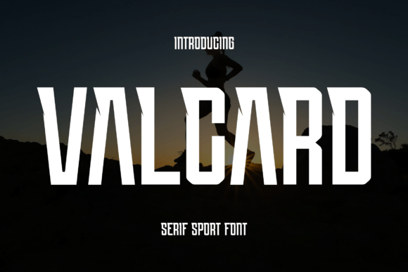
Valcard is a premium display font built for impact—not decoration. Its clean lines and balanced curves give it a refined modernity, while its generous x-height and open counters ensure strong legibility even at smaller sizes. Unlike some decorative display fonts that sacrifice function for flair, Valcard maintains clarity without leaning into austerity. It’s elegant but never fussy, bold but never aggressive. In practice, that means it works beautifully over image banners, on dark mode backgrounds, and across responsive breakpoints—especially when used intentionally.
Real-World Performance Across Devices and Contexts
I tested Valcard across several real web scenarios: a portfolio homepage hero, a course sales page headline, a small business blog header, and a product-focused landing page CTA banner. On desktop, it shines at 48–72px with modest tracking—ideal for establishing immediate hierarchy. On mobile, I found it remained highly readable down to 32px (with slightly increased line height), especially when paired with a neutral sans serif body font like Inter or Open Sans.
One unexpected win? Valcard performs exceptionally well over textured or gradient backgrounds. Its consistent stroke weight and smooth terminals prevent visual “vibration” or blurring—something I’ve struggled with using more contrast-heavy display fonts. And because its letterforms are well-proportioned—not overly condensed or extended—it scales cleanly without awkward gaps or crowding in responsive containers.
Where Valcard Excels (and Where to Pause)
Valcard is purpose-built for display use—and that’s exactly where it delivers. Use it confidently for:
- Hero headlines and section titles — creates instant visual authority
- Call-to-action buttons — adds warmth and distinction without sacrificing clarity
- Logo lockups or wordmarks — its balanced proportions lend themselves well to branding
- Digital ads and campaign banners — stands out in fast-scrolling feeds while remaining legible
- Blog post headers and featured quotes — brings editorial polish to content-driven sites
That said, Valcard isn’t designed for body copy, navigation menus, form labels, or dense interface elements. Its personality lives in emphasis—not exposition. For accessibility and usability, always pair it with a highly legible, WCAG-compliant sans serif for paragraphs, captions, and UI text. Also, avoid using it below 20px—even with optimized webfont loading, fine details can soften on lower-DPI screens.
Smart Pairing and Practical Implementation Tips
In every project I tested, Valcard paired most naturally with a humanist sans serif—think Inter, Poppins, or even system fonts like -apple-system for lean performance. The contrast between Valcard’s graceful curves and a clean, functional body font creates rhythm and reinforces hierarchy without competing. For more editorial or luxury-leaning brands, I also experimented with pairing it against a subtle serif like Lora or Playfair Display—and found it held its own, adding dimension without clutter.
Before deploying Valcard in production, I checked what was included: multiple weights (Light, Regular, Bold), true italics (not skewed), standard OpenType features, and robust multilingual support—including Latin Extended-A and basic diacritics. Crucially, it came with WOFF2 files optimized for fast loading, and the license explicitly covers commercial web use, client projects, SaaS platforms, and digital templates. No surprises, no last-minute licensing checks mid-launch.
Branding Consistency Without Creative Compromise
What surprised me most was how Valcard strengthened perceived brand cohesion—not just visually, but emotionally. On a coaching site, it softened the tone of technical language; on a creative portfolio, it added sophistication without coldness; on a product landing page, it elevated perceived value before users even scrolled. Because it’s versatile yet distinctive, it avoids feeling generic—but because it’s restrained, it never overwhelms the message.
For makers building digital products—whether online courses, downloadable templates, or branded web kits—Valcard offers reliable expressive power. It’s not flashy for flashiness’ sake. It’s thoughtful typography that supports strategy, enhances trust, and quietly signals care in craft. And in a landscape full of loud, overdesigned fonts, that kind of calm confidence is rare—and deeply effective.